Get the next one in your inbox
Practical tips for working in a club. Occasional emails, easy unsubscribe.
How to Choose Hero and Page-Header Images That Don't Look Like Stock Art
07/14/2026
The big image across the top of a page is usually the first thing someone sees when they land on your club's website. These banners come in two forms. A hero image is a large, eye-catching banner displayed prominently on a page, often the very first thing on it. It works as a visual hook that grabs attention and establishes your club's character the moment the page loads, which is why it usually anchors a homepage. A page-header image is a prominent horizontal banner too, but smaller than a hero, sitting at the top of an inner page. It carries the look and colors of your homepage through the rest of the site and sets a page's content off from the menu above it. Either way, a real photo of what your club is about, cropped well, makes the page feel like yours in an instant. A generic stock photo does the opposite. It quietly tells visitors the site was built from a template and nobody replaced the placeholders.
The good news is that you almost certainly have better material than any stock library. It's on your members' phones, in your Facebook group, and in the photos from your last event. The work is in choosing the right shot and, just as much, in cropping it well.

What makes a banner image work
A banner image has one job. It shows a visitor what your club is about in the couple of seconds it takes to form a first impression. A few things make that work.
It shows the real thing. A photo of your club's actual focus (the dogs, the trail, the workshop, the boats) beats a posed group lined up against a wall. Show the activity or the subject, not people standing still for the camera. And never a stock photo of strangers. Visitors can tell, and it whispers that you couldn't find a photo of your own club.
It has one clear focal point. Your eye should know where to land. A frame crowded with people, tables, and signage reads as noise. One strong subject almost always wins.
It survives a hard crop. These images are wide and short, so the top and bottom of your original get cut away. Whatever matters has to sit in the middle band.
It's sharp and well lit. This is the biggest image on the page, so any blur or murk gets bigger with it.
Go easy on text. Clubistry doesn't lay words over a hero, so any text has to be part of the photo itself. Keep it to a minimum and only where it earns its place, make it large enough to read comfortably on a phone, and put the same wording in the image's alt text so screen readers and search engines still get the message.
Crop tight, crop bold
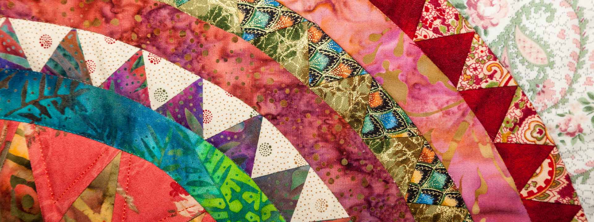
Most club photos aren't bad. They're just too far away. The single biggest improvement you can make is to crop in harder than feels natural.
A tight crop fills the frame with the subject and pushes everything distracting off the edges.

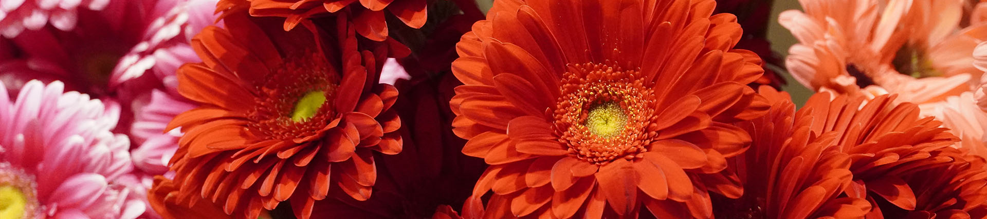
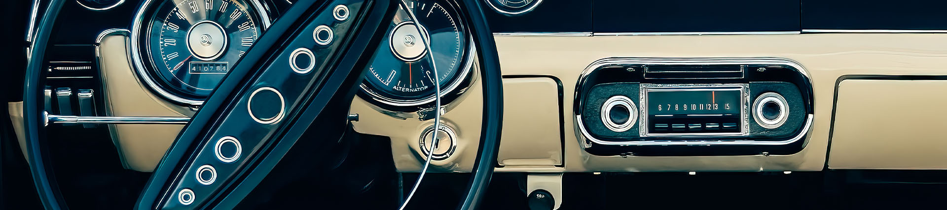
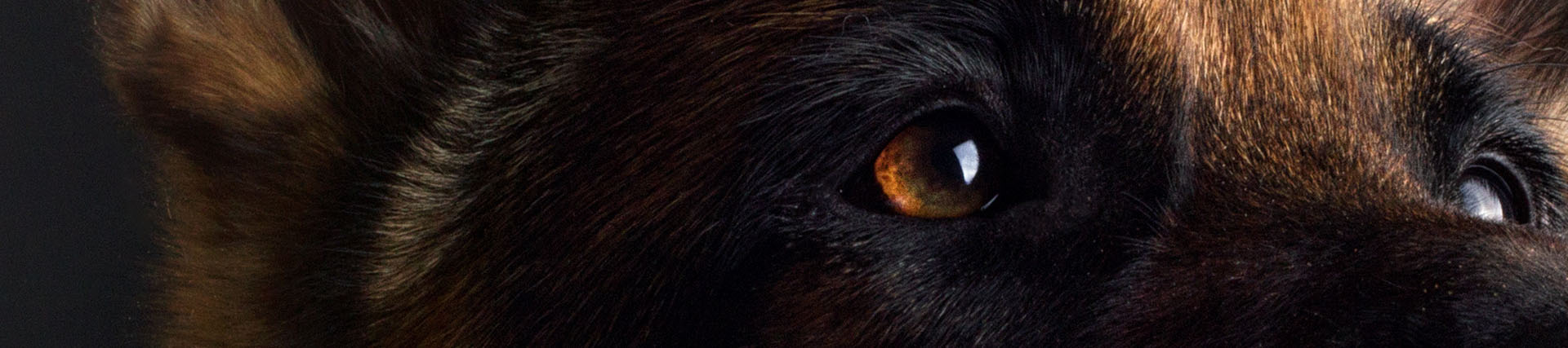
An unexpected crop can be stronger still. Show a close detail instead of the whole scene. A pair of hands at the potter's wheel instead of the whole studio. The dog's focused face instead of the whole ring. A single chess piece in focus instead of the whole board. The detail draws people in.
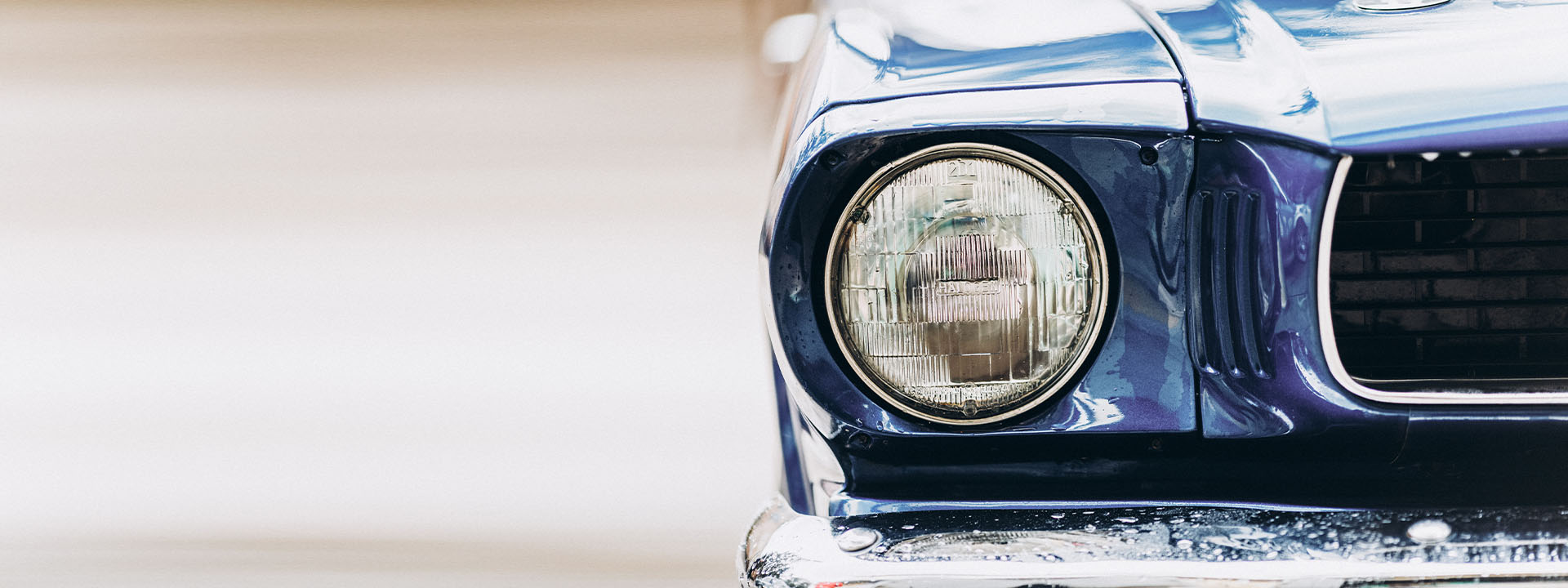
This matters even more for a page header, the shallow banner that runs across the top of a page. It's far shorter top to bottom than a hero, so a wide landscape almost always has to become a tight horizontal slice of one strong element. Lean into that. The constraint is exactly what makes these images look deliberate instead of accidental.
Using heroes on a page
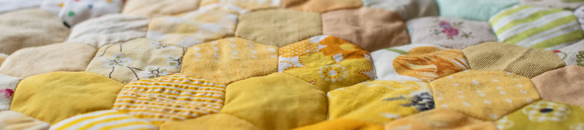
A hero's job is to grab attention and set the tone for your club, so give it room to do that. It's its own section, separate from the content above and below it, which means it doesn't have to sit at the very top of a page, though the top of a homepage is where it does its strongest work as the first thing a visitor sees. Clubistry lets you arrange a page's sections in any order, so you can drop a hero wherever it earns its place. And because a hero can be a link, you can turn that attention into a next step by pointing it at the page you most want visitors to reach, like your membership or events page.
You can also place more than one hero on a single page. Rather than stacking them together, a great use is as dividers between content sections, spacing strong, linked images down the page so each one breaks up the text and points visitors somewhere useful. A set of static heroes used this way is clearer and friendlier than a rotating slideshow, which hides most of its content behind controls, moves on its own, and tends to be fiddly on phones and for screen readers. Images a visitor can actually see and tap will usually outwork a carousel.
Where to find good photos
You rarely need a photoshoot. Most clubs already know which members take the best pictures, so start there and ask them first. If you're not sure who that is, scan your Facebook group for the people whose event photos consistently stand out. From there, anyone with a decent phone can shoot candidly at your next event, and you'll have plenty to choose from by the afternoon. If a recognizable member appears on a public page, keep a simple photo release on file from when they joined or registered, which saves an awkward conversation later.
When you don't have the right photo yet
Sometimes a page needs to go live before you've got the perfect shot. A tight close-up of something telling, like a trophy, a tool, or a piece of equipment, often works better than you'd expect. A simple patterned banner in your club's colors looks intentional in a way a mismatched stock photo never will. A current photo of your home location can feel grounded and real. Treat any of these as a placeholder and keep an eye out for the real thing.
Where Clubistry fits in
Clubistry gives you two kinds of banner, and they work a little differently. A hero image is the large image you place on a specific page with the Hero Image Section, and it can link to any page you choose, such as your join or events page. Its shape is 8:3, and it looks best from a source between 1920 × 720 and 2880 × 1080 pixels. A page header is the wide, short banner across the top of your Default layout pages, managed under Site Builder. It's a shorter 4.5:1 shape, the same widths in a shorter band at roughly 1920 × 427 to 2880 × 640, and Clubistry pulls headers at random from whichever ones you've set active, so each one should suit any page rather than a single topic.
The Media Library ties it together. Store a good photo once and you can reuse it across pages and re-crop it for each shape without uploading it again.
The line between a site that looks professional and one that looks generic is almost entirely the images. And the best ones are usually a good crop away, on a phone you already have.
Like this? Get the next one in your inbox.
Practical articles, tips, and ideas for working in a club. Occasional emails, easy unsubscribe.